I'm really pumped to be teaching at Quilt Con in February! SOFT CRITICISM - space…
Bound
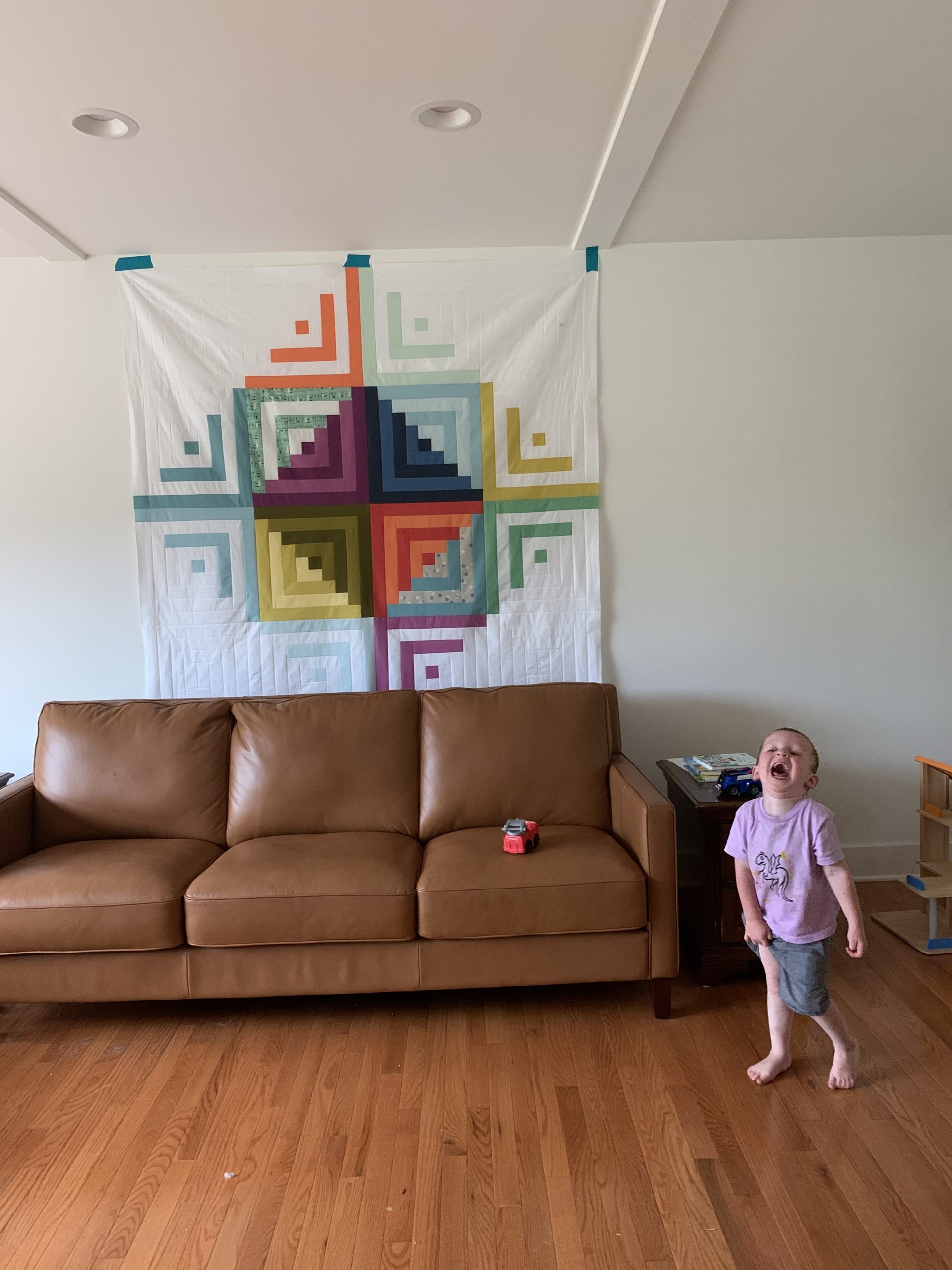
The DoublePlusGood Quilt is done.
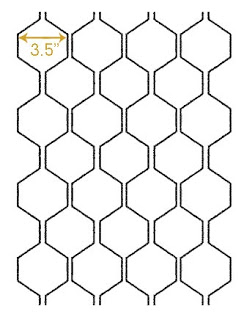
My plan to have it quilted in a honeycomb/hexagons worked out quite well. The long arm quilter I took it to, Bernie, was happy to order and work with the pantograph I had found on the internet.
Once it was quilted, however, we realized that the width marked 3.5″ above (my marking and my confusion) should have been 7″ This meant that there were great big areas of the quilt that weren’t quilted–the inside of a 7″ hexagon. Oi. Bernie and I laid the quilt out on her floor and tried to decide what to do.
Pick it out and start over? I almost never pick anything out. I think in the entire course of making this quilt I only unpicked one seam and it was because I had stitched in a block upside down (and it had words on it).
Add something inside the hexagons? Too distracting, I thought.
Add another all-over pattern? Maybe, but what?
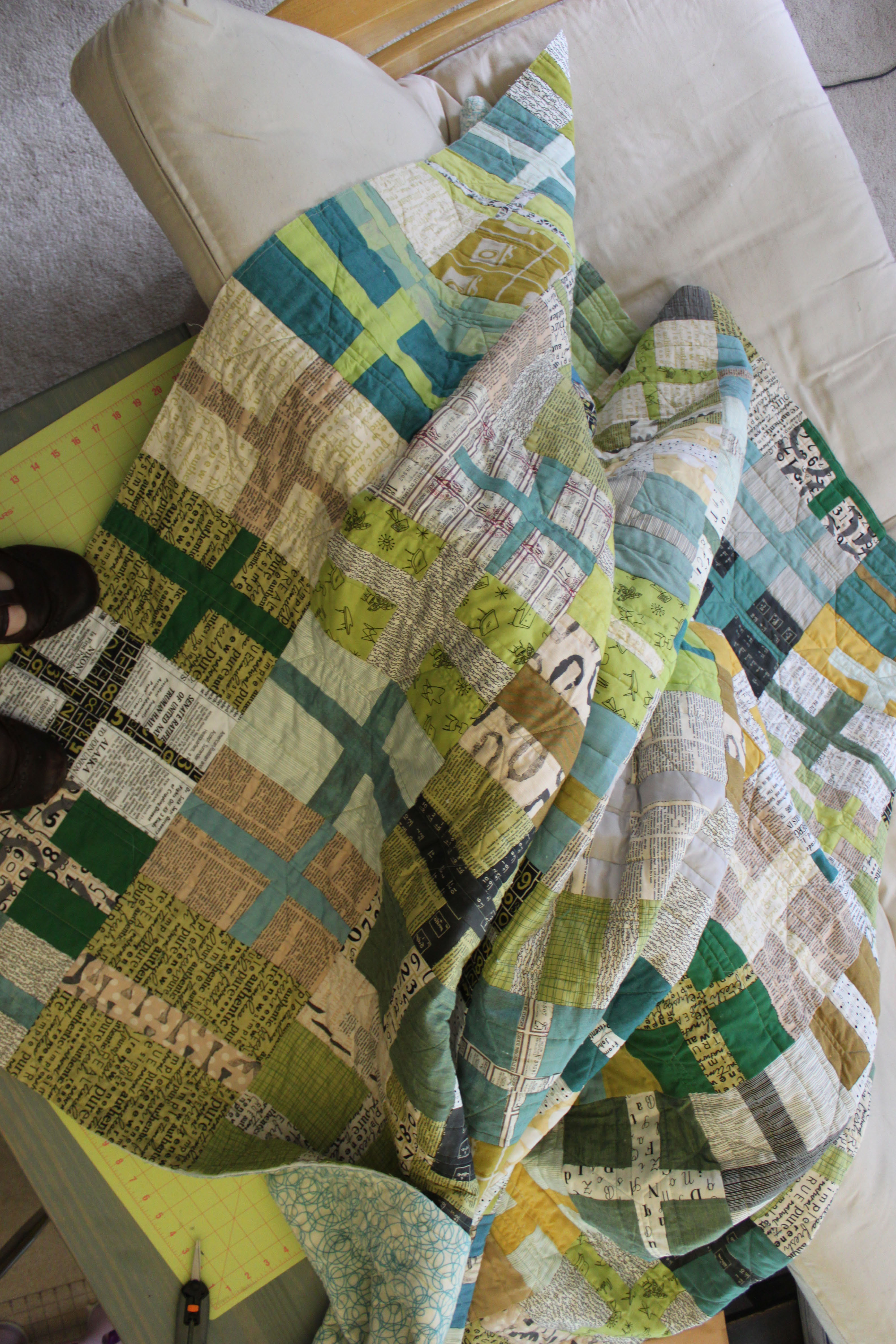
Ultimately, we decided to add in straight vertical lines all over the quilt. They are ruler straight and between .5 and 1.5 inches from each other.
The final outcome is pretty awesome. Depending on the angle at which you view the quilt, the quilting either disappears, or you see the hexagons, or you mostly see zig-zags, or you mostly see the vertical lines. The thread used is a Sulky Blendable and it mostly disappears, which is what I like in quilting. I’m 90% about the piecing and so I want quilting that doesn’t distract from, but supports the effect of the piecing.

Anyway, when I got the quilt back I then had to make some decisions about the binding.
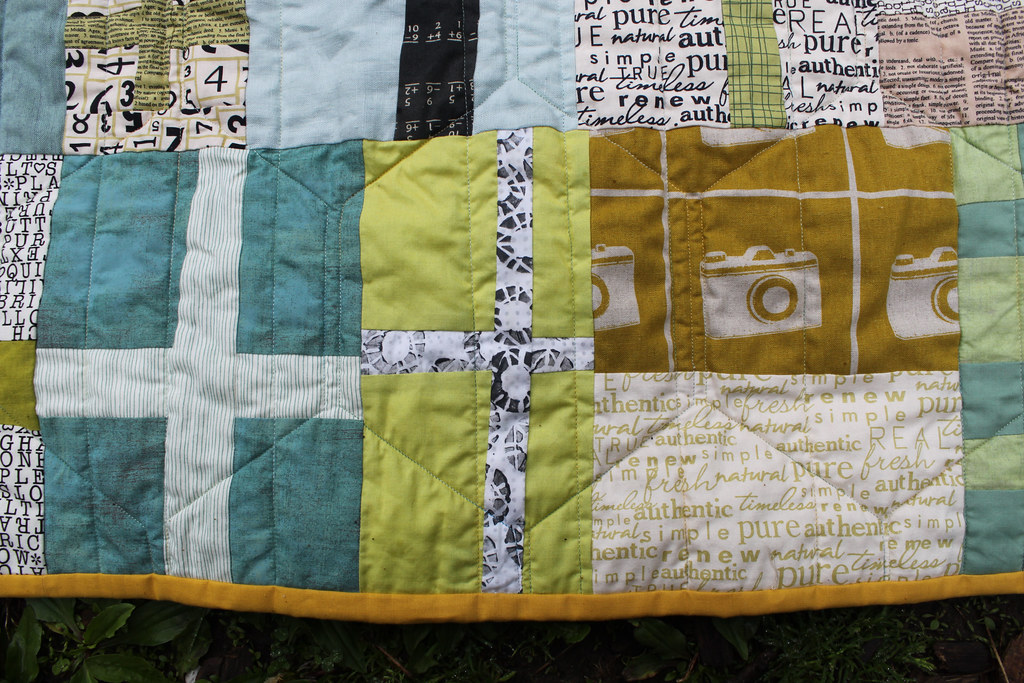
I often have an idea about the color of binding I will use from the get-go, but I did not in the case of this quilt. I auditioned quite a few colors and ultimately settled on using some Kona Curry.
This is a decision I’m still not 100% confident in. But, I’m thinking it will grow on me.
Part of why I chose the Curry is because it looks really nice with the backing. Some of the other colors I auditioned (lime green, off-white) did not.
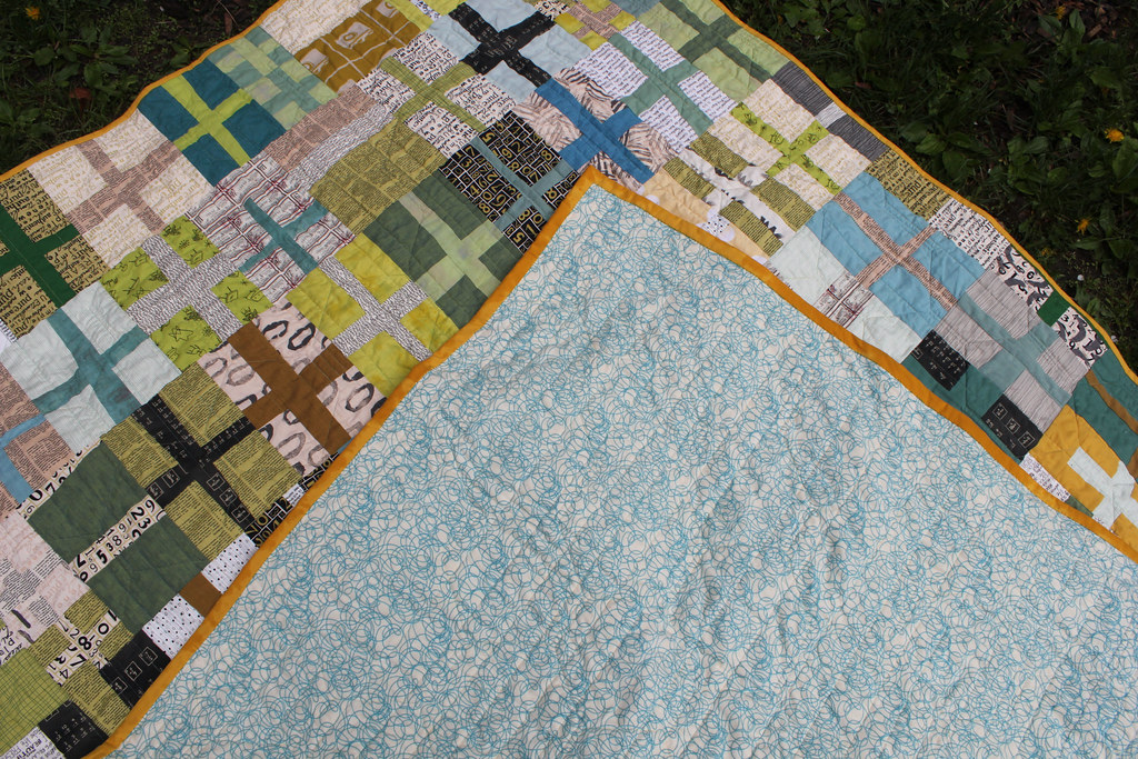
The backing is a nice quilter’s flannel that I got for a steal a few years ago. It has been hanging in my closet waiting for a quilt to back.
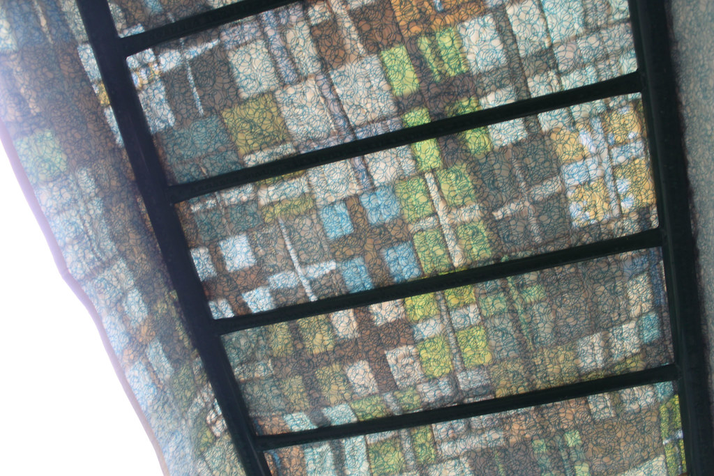
By the way, check out the awesome corners on this thing!

I recently noticed that my corners, never having been perfect, were getting WORSE. While I don’t demand perfection of myself, I do expect improvement, so I read over the instructions for binding in Denyse Schmidt Quilts: 30 Colorful Quilt and Patchwork Projects just before sewing on the binding and ended up with a much better result than my recent attempts. This is straight-grain binding, cut at 2.5″ and with a single-fold. If you’ve never read over Elizabeth Hartman (Oh Fransson!)’s directions for making continuous binding (find it here) I highly recommend it!
I finished stitching on the binding at a sew-in with some ladies from the Ann Arbor Modern Quilt Guild. It’s been raining since then, but I finally snuck the quilt out during a break in the gloom to snap a few pictures of it on the monkey bars:

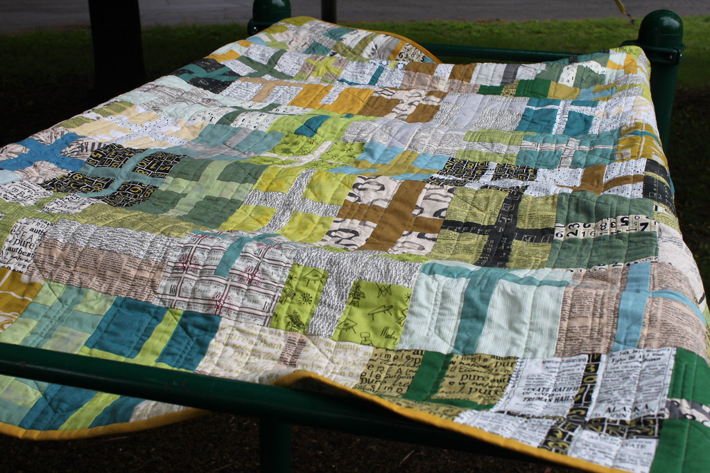
By the way, as I was taking these pictures, a 20-something guy with a backwards baseball cap and tattoos all up his arm, driving a pick-up truck with over-sized wheels, leaned out his window to tell me he loved my quilt. Pretty cool.
Related Posts
This Post Has 25 Comments
Comments are closed.
I love your quilt, too. And the binding is great with these fabrics. Hope you bring it to A2MQG Wednesday so we can see this in person.
This turned out great! And when in doubt, bind it with Curry. 🙂
Count me as a fan of the curry. It plays well with all the fabrics, and especially well with the backing.
And what a great set of photos! I love the back lit shot through the monkey bars.
love the curry! love the whole quilt! I hope some lucky quilter finds the tattooed man in the backwards baseball cap and pick-up truck 🙂
it is FABULOUS! i lovety-lovety-love it!
So cool.
True improv spirit. Tim Gun would be proud.
this is sooo pretty rossie. send it to me? hehehe I just love all the fabrics you picked and I think the binding adds a nice pop!
This quilt came out terrific! Great choice for the binding fabric.
your quilt is gorgeous! and i love your choice of photography at the playground 🙂
It's beautiful! I just love all the fabrics you've used in this one.
I really like the curry binding. It helps the yellow bits in the quilt pop a little more.
Also love the revised quilting plan! I'm so glad you didn't unpick all the hexagons.
Curry is one of my favorite Kona shades, and I think it was a great choice for your binding. Your quilt is awesome!
Love it! The quilting really adds to the quilt. I think the curry was an excellent choice.
I love your quilt, and I think the binding gives some nice contrast. I laughed out loud that a 20-something guy made a point to compliment your quilt!
That Kona Curry looks really great with the blues and orange/browns in the quilt itself – great choice!
I agree with the tattooed man, this is an awesome quilt. I think the Curry looks perfect with the fabrics as well, everything about this quilt is great!
You inspired me! I used this picture on my blog (with due credit, of course!) please stop by! http://right-here–right-now.blogspot.com/2011/05/feeling-inspired.html
I have seen this design in a few different places, and I really like it. You chose great fabrics – really nice colour scheme. I live in Italy so I send you my "complimenti" for a gorgeous quilt!
ann
What a treat to get up close and personal with your quilt this morning. Thanks for the great pictures. I love everything about it….especially the compliment the nice 20 something macho paid to it.
I love the fabrics u used. Can you tell us the names of the fabric. Thank you this is gorgeous. I definitely would like to make this . thanks
Tammy—your email address doesn't show in your comment (check your blogger settings), so I'm replying here in case you see it.
These fabrics were pulled from my stash the one "line" of fabric that has multiple prints is Authentic from Moda. The rest are randoms that were collected over time, plus solids, crossweaves, and shot cottons.
I love your quilt. Can u tell me what fabrics you used or just the designers. Thank you.
Hi:
I am wondering how you put the blocks together… Did you use a pattern? did you start with a fixed size square and cut them up through the middle, more or less and then sew on the cross pieces?
I want to make a quilt like this for our minister who is retiring next year. I would be very greatful for any information you wish to share. I LOVE your quilt!
What a beauty !~! The binding color just brings it all together. Brilliant choice. I'm a new follower of your blog. Thanks for posting and sharing.
[…] to the patchwork. Usually, this results in either a fairly minimal all-over design (see the The DoublePlusGood Quilt, Miss Stinky’s Particle Board Cabin) or for a long time I have favored straight-line quilting […]